Are TV Series Getting Shorter?
Hello !
Welcome to my fifth post on the 'other' page. For better visibility, I advise you to read my posts on a computer and on my website (if you are reading this from the newsletter) by clicking just above on "View in browser", rather than directly from the email.
A few weeks ago, I was scrolling through my watchlist and realized something: almost every recent series I'd watched had 8-episode seasons. The Night Agent, Fallout, Cross… all hovering around 8 episodes. I remembered a time when 22-episode seasons were the norm (for example, Person of Interest, which I highly recommend!) — network TV pumping out content week after week for months on end. That feeling of "wait, didn't seasons used to be longer?" turned into a question I could actually answer with data.
So I did what I always do: I opened RStudio and started digging.
The idea
The question is simple: are TV series really getting shorter, or is it just a feeling? And if they are, when did the shift happen — and does it line up with the rise of streaming?
To answer this, I turned to IMDb's non-commercial datasets, which are freely available and contain structured data on millions of titles: series, episodes, ratings, runtimes, genres. Everything I needed to trace how the TV format has evolved from 2000 to 2024.
The approach
Rather than looking at all series (which would include thousands of forgettable shows), I focused on the top 20 highest-rated series each year, filtered by a minimum of 10,000 votes on IMDb. This gives a curated lens: not what the industry produces, but what audiences actually watch and rate highly. I also excluded talk shows, reality TV, game shows, and news programs to keep the focus on scripted content.
The dataviz is structured around three questions, each answered by its own chart. To scroll inside the visualization to navigate between charts, hover your cursor over it first.
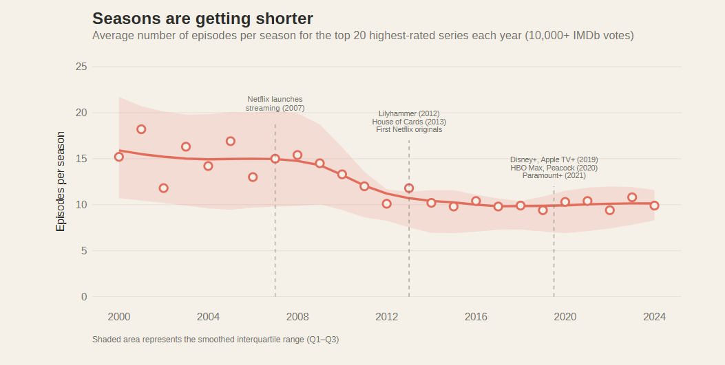
What the data shows
- Seasons are shrinking. The first chart tracks the average number of episodes per season over time. In 2000, the top-rated series averaged around 18 episodes per season. By 2024, that number had dropped to roughly 8. The decline isn't linear: there's a first dip around 2007 (Netflix launches streaming), a steeper drop after 2013 (first Netflix originals), and a near-flattening post-2020 when the 8-to-10-episode format becomes the default. The shaded interquartile range shows the spread narrowing too — less variety, more standardization.
- The cloud compresses. The second chart is a strip plot where each dot is one season of one series. You can literally see the "cloud" of points squeezing downward over 25 years. In the early 2000s, dots are scattered from 6 to 24 episodes. By the 2020s, they cluster tightly between 4 and 10. This pattern isn't just about time — it's also about quality: the highest-rated seasons (9+) average only 10.8 episodes, compared to 14.7 for those rated 7.5–8. Shorter seasons, better ratings. The chart is interactive: hover to highlight series by rating bracket, or use the search bar to find a specific show and trace its seasons across the timeline.
- Longer episodes to compensate? If seasons are shorter, are episodes getting longer? The third chart combines density curves and boxplots across three periods. The answer is nuanced. The 22-minute sitcom format, dominant in the 2000s, hasn't disappeared, but the center of gravity has shifted toward 45–60 minute dramas. Recent prestige series tend to deliver fewer, but denser and longer episodes. The trade-off is real, even if it doesn't perfectly balance out.
Why this dataviz
I've been thinking about what makes a dataviz project worth doing — not just technically, but as something worth publishing and sharing. For me, this one checks the boxes: it starts from a genuine question (something I actually noticed as a viewer), it uses a rich public dataset that tells a real story, and the answer isn't obvious before you look at the data. The streaming revolution reshaped how we consume series, and it's satisfying to see that transformation show up so clearly in the numbers.
It's also a project where interactivity earns its place. The search function on the strip plot isn't a gimmick — it turns a dense chart into something you can explore personally. Finding your favorite series in the cloud and seeing how it fits the trend is the kind of engagement that static charts can't deliver.
Thanks for reading! I hope it was clear and you enjoyed it.
You will find the code below by clicking the github link button.
If you have any questions or remarks, I invite you to create an account (it's free) to write a comment, or simply to be notified of a new post in the future !
See you soon for new content 👋


Comments ()