Combine multiple touchmaps into one graph, adding elements like flags
Hello,
Welcome to this second football post. For better visibility, I advise you to look at my posts on a computer (for the size but also because the colors differ on a phone that has a dark theme like me. If the theme is light, only the size makes it difficult to read).
This will consist in learning how to build several touchmaps on a single graphic, while adding particular elements like images (here, country flags).
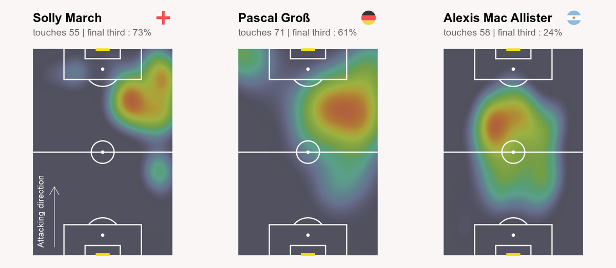
If you didn't see the first post, I invite you to read it (by clicking here) because I'm going to use the same data to make a graph equivalent to the one of Sonofacorner.
Moreover, I won't explain again what is already explained in this first post...
As for the other posts, you will find the code at the bottom of the page !
So...I think we can start ! 😇
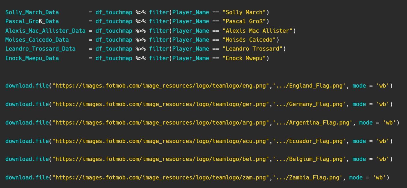
So we start from our dataframe df_touchmap, and select several players. Of course, it is possible to do this later directly in the ggplot, but I prefer to go through different pre-designed objects.
At the same time, I upload the necessary flags (referring to the nationalities of each of our selected players). To do this, many alternatives are possible, but I followed the same as Sonfoacorner, by going directly to take them via the website Fotmob and using the url that you can find by inspecting the html code.
Then, we create our 6 plots by changing each time the data argument in the geom_density_2d_filled (Solly_March_Data, Pascal_Groß_Data, ...).
The only elements to change in our script for each plot are the margins (and the annotation concerning the direction of attack, but this is optional...).
To do that, we adding to each script a theme() line with in it plot.margin = unit(c(1.5, 1, 1, 1), "cm"). This will result in more space between our 6 pitches, and thus allow the addition of elements !
Now that our 6 plots are created and contained in objects (Solly_March_Plot, Pascal_Groß_Plot, Alexis_Mac_Allister_Plot, Moises_Caicedo_Plot, Leandro_Trossard_Plot, Enock_Mwepu_Plot in my script), we can assemble them on a single graph. We can also create objects for our global title and subtitle.
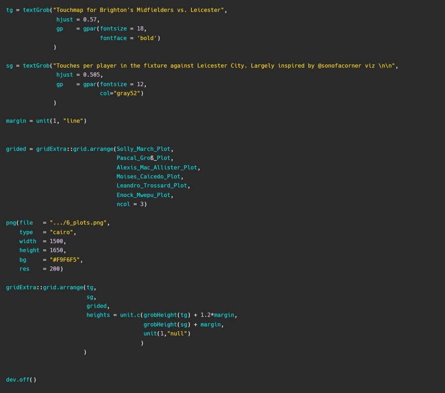
I asked for 3 columns, so he deduced that there was a need for 2 rows, but it would obviously have been possible to make another representation.
So we currently have this graphic which contains our 6 plots and our title/subtitle :
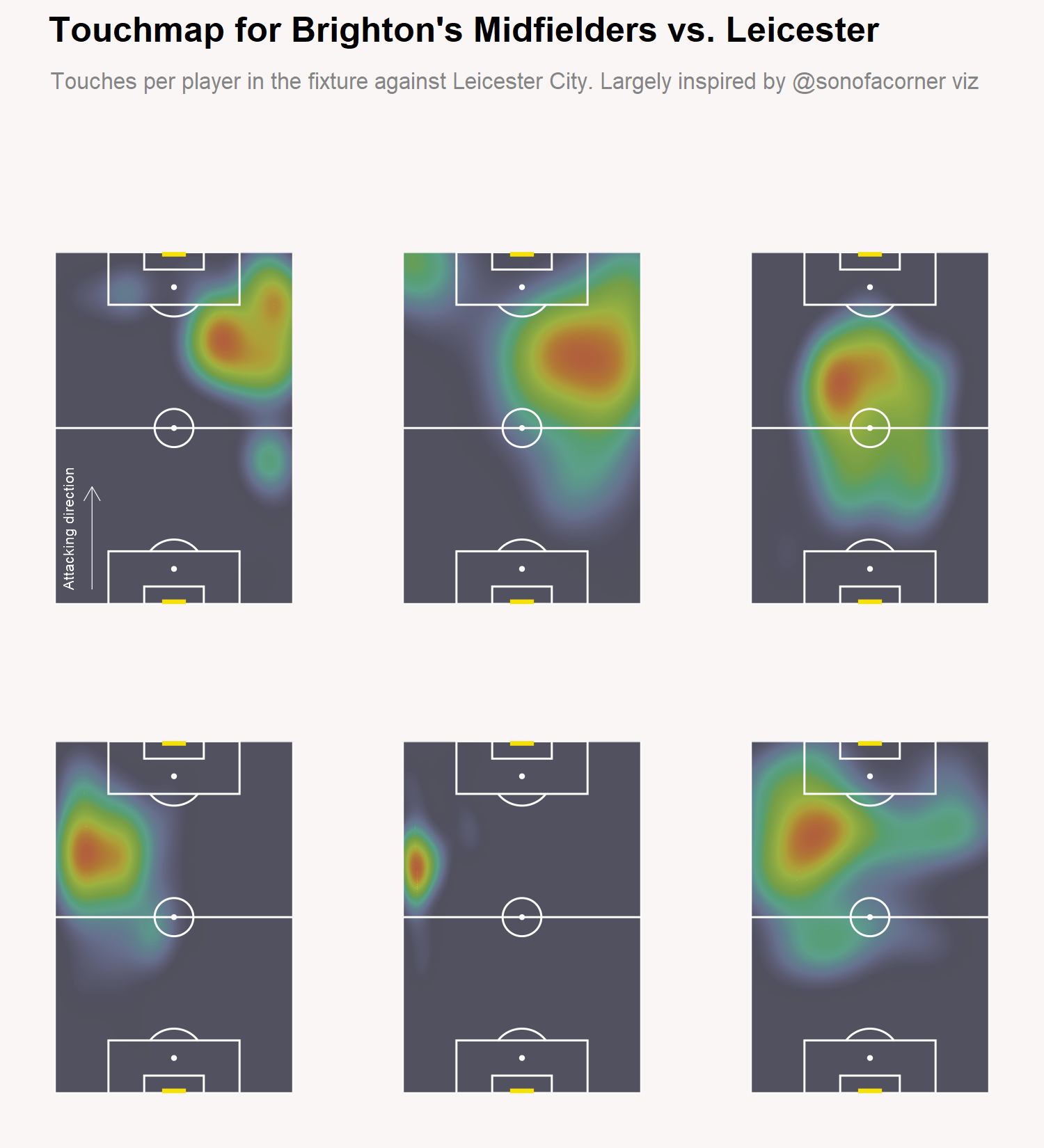
We are almost done ! All that's missing are the final annotations above each pitch and the flags.
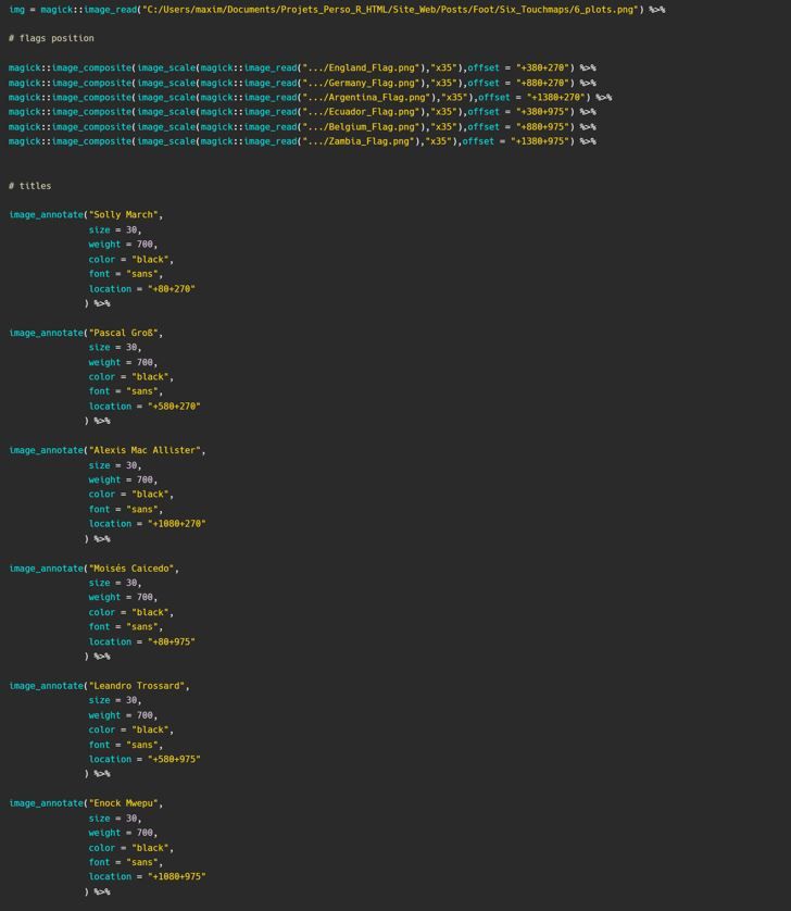
To do this, I use the magick package which allows to do image processing.
In our example, the procedure will be as follows :
- Import our 6 plots graph using the image_read function
- Add the flags (with coordinates) with the image_composite function
- Add textual annotations using the image_annotate function
- Save the final image
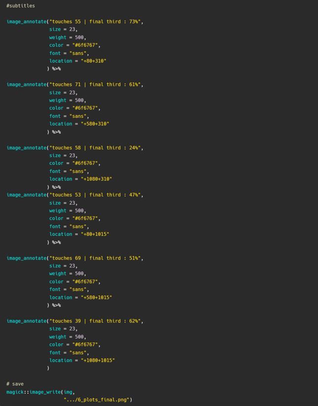
It would have been possible to automate the text annotation part, but this is not the goal here (maybe next time ? ).
So here is the long awaited result... !

You will find the code below by clicking the github link button.
 MaximeDeniaux
Thanks for reading ! I hope it was clear and you liked it.
If you have any questions or remarks, I invite you to create an account (it's free) to write a comment, or simply to be notified of a new post in the future !
See you soon for new content 👋
Comments ()